When we talk about the evolution of the Yankees uniform it’s done so a little tongue-in-cheek, as this baseball team has barely made any changes to their kit in over a century. The Yankees have worn pinstripes since 1912 and made jersey numbers a permanent fixture in 1929, and since then not too much has changed.
There are however some subtle differences that have been made over the years, and aside from advancements in textile technology, the Yankees uniform has enjoyed some sprucing up and modernization.
A Season for Change
There are several myths that surround this majors team uniform too, one being that the team introduced pinstripes in an attempt to slim down Babe Ruth, as he was a little too fond of hot dogs! Pinstripes were however introduced before Ruth moved from the Red Sox to the Yankees, so there’s no truth to the rumour.
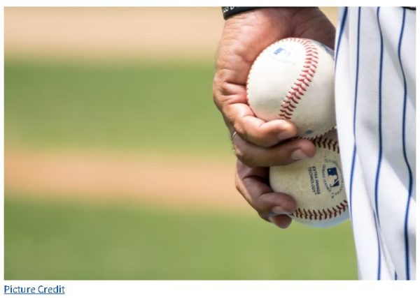
Since 1936 there have only be a few minor changes to the Yankees uniform, and to this day the away kit is grey, and the home kit is white with blue pinstripes. There are even baseball betting sites that accept bets on when or if the uniform will change, and so far, no one has wagered and won.
Let’s take a look at the subtle changes that have occurred and how the uniform has evolved ever so slightly.
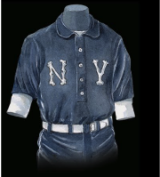
1903: At the end of the 1902 season the Baltimore Orioles moved to NY and are renamed the New York Highlanders. The team’s new uniforms were cream for home games and navy blue for away, and both featured an elaborate, but not interlinked N and Y on the chest. The shirts were collared and the button reaches down to the midriff, with the N and Y on either side.
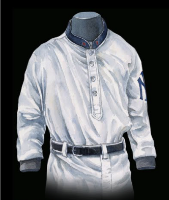
1905: The N and Y are interlocked for the first time, but a year, later, they are scrapped and the original logo makes a comeback. In 1909 the logo moves from the shirt-front to the sleeve.
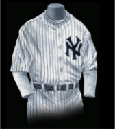
1912: The interlocked NY logo makes a return, and moves from the sleeve to the front of the jersey. The team is officially renamed the Yankees and a new brand is born. The pinstripes make their first appearance.
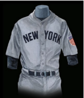
1917: The interlocked NY logo vanishes again and the words New York appear emblazoned across the front of the jersey.
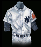
1936: The interlocking NY makes a return to the home uniform.
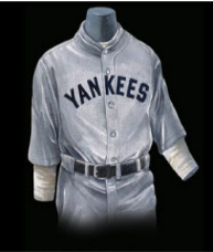
1943: For 3 years the away uniform is emblazoned with Yankees instead of New York.
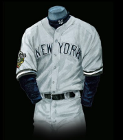
1974: The Yankees official apparel company, Wilson suggests an alternate away uniform after the Yankees were in the 10 year of an 11 year first place drought. The designs are scuppered and the uniform stays the same.
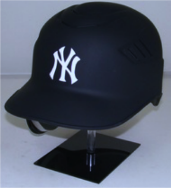
2016: The Yankees quietly change their away batting helmet from a gloss finish to a matte. No announcement was made regarding the change, but eagle-eyed fans spotted the lack of shine almost straight away.
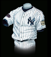
Today: The Yankees home and away uniforms look almost exactly the same as they did in 1936, but the cut and fabric has moved with the times. The kit remains a reflection of the pride the team feels, their patriotism and history, and they seem to subscribe to the notion that if you have something that works, don’t change it!






One Response